Final Image for Interactive Wall

From the most recent photoshoot I did, playing upon the idea of innocence/sweet/girly teenagers, I managed to get around 20 really successful images that will be used for content in my zine for the exhibition. I am going to use one of these images to write a question on it for the interactive wall part of the space. The question I will be asking is ‘What piece of advice would you give your teenage self?’.

Here is the final outcome that will be out on the wall – it will be printed A1 size, to give impact but not too big, so that it doesn’t take away from the main part of the piece which is the bedroom space.

EMILYTHOMAS_A2_tobeprinted.jpg

Intentions for Final Zine Publication

For the zine publication, there are certain aspects I want to include, in order to create a zine that works well with not only the rest of my project, but the immersive space I am also planning.

I want the magazine to be a realistic representation of being a teenager/adolescence. I will base this of me and my peers experience, and how I remember this specific period in my life.

Things I want to include:

  • original text from questionnaires
  • my own writing style
  • scrapbook style pages
  • photos from shoots so far
  • simple pages just with photographs

I want to include contradictions throughout the whole piece, as I feel like being a teenager is one whole contradiction, as you transition from an innocence state, and starting to discover more adult things, such as drinking, sex etc. I will include more innocent things, like the ‘innocence’ shoot pictures, as well as images of people smoking.

Here are some of the zine pages so far:

05_GRIMYINBG07_NO RAGRETS + BRACES011_back pocket close up013_MESSAGES016_KATIE SMOKING (1)017_fuck it019_young things run tings021_ inverted shoes022__LIFE IS GOOD024_wow im in love + photocopied hand

Playlist Page

A lot of my inspiration for this zine, in terms of content, layout, style of photography and font styles has come from my genuine love for magazines and zines, that are more raw and gritty. Examples of these are The Messy Mag, The Rookie Yearbook, Hate Zine, LOVE Magazine etc. Many of these include playlist pages, where playlists are created based on a certain topic or vibe, eg. ‘a playlist for heartbreak’, or ‘a playlist for a good ol boogie’. (examples from Rookie)

I wanted to create my own page based on a playlist that would hopefully take the reader back to a particular time. I used examples from the questionnaire, where I asked my peers (what song reminds you of being a teenager), as well as songs I personally feel take me back to this particular time.

FINAL DRAFT OF PLAYLIST PAGE:

010_PLAYLIST.jpg

I used this blue colour as it matches with the rest of the colour scheme of the zine, and it worked well with the white writing. I also scanned in some smiley face stickers, and added them to the design to add more interest to the page. The writing is done in my handwriting to follow the theme, as the rest of the zine is also my handwriting too.

Interactive Wall idea

In order to draw the audience in to the space more and also for them to relate and really think about my project/being a teenager, I want to include an interactive element. As the questionnaire worked so well and I got many interesting responses (that I am now using in my final publication), I thought I should ask the audience a question and they can write it down and stick it on the wall for others to see.

POTENTIAL QUESTIONS FOR INTERACTIVE WALL SPACE:

  • what piece of advice would you give your teenage self?
  • what is a song that reminds you of being a teenager?
  • what is a film that reminds you of being a teenager?
  • what is a quote you try to live your life by?
  • what was the first CD you ever bought?
  • if you could go back to being a teenager forever, would you?

LAYOUT

I think the best way to layout the space would be with a question at the top, and then post it notes that can be stuck down on a wall surrounding the area. Here are some images that show examples of that:

688c40738b82bc32fa4f1b18288344adc5d71bb699c71f060a74cdc9a4cf7d47e8523d72522bffdce79c850ae9636c2afa43a22e902ab58d009d2b80af683921

Immersive Space – Bedroom

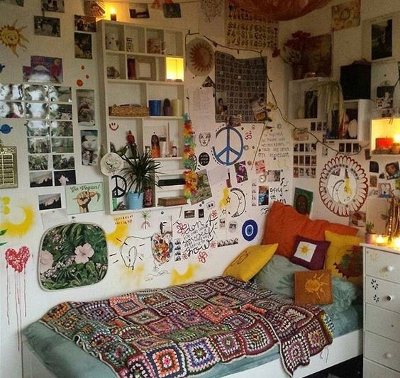
Along with a zine publication that includes photography, collage and written text, and an interactive wall, I have decided that the main aspect of my final outcome will be an installation piece that is an immersive bedroom space.

A CONTRADICTORY SPACE….

  • makes the audience question things
  • realistic – adolescence is not that simple
  • helps to build a story
  • helps to build a character
  • more relatable

why?

I have chosen this because my aim for this project was not only to capture adolescence in its truest form, but to also try to really capture/create a feeling and emotion surrounding this time. I know for me, and most other people, growing up and being a teenager is not always as perfect/sweet/innocent as the teenage magazines (that I previously looked at) make it out to be. Therefore, by creating a bedroom space, with the right furniture, objects, decorations and lighting, I should be able to produce this feeling for the audience. I hope that people are able to connect, whether it be through certain items that remind them of that period in their lives, or just through the aesthetics of the room as a whole.

how?

I now need to start sourcing items for the space, in order for it to come together as I imagined. I have planned the measurements and general logistics of the space. I aim to have a bed, bedside table, rug, posters on the walls, particular lighting (dimmed lights, fairy lights and a lamp) and many other objects. I want the space to be messy, and have items that give it a rougher, more realistic edge, such as cigarettes, tampons, condoms etc.

inspirations?

Tracey Emin is the main artist who is inspiring this idea, as she creates work that is incredibly real and raw and she really doesn’t hold back. Her work is also very much about her – her experiences, feelings, emotions during particular periods, and memories. I have also made a pinterest board that culminates images that help to show the sort of space I am hoping to create – https://www.pinterest.co.uk/emulythomas/final-exhibiton-space-inspiration/

0e8b4c4cedf736bc51fd68a0dbcedda969d9fd4f144afe12383bdc569b4c566403439ed6119aceb9411f800e2a1a8599fc4e741cf88dcfb6d79b4e00c9708d40


Sourcing items/logistics of final outcome

List of items I need to source/I think should go in the room:

  • bed
  • mattress
  • duvet
  • bed sheets
  • range of pillows
  • blankets
  • teddy bear
  • cds
  • books
  • films
  • condoms
  • tampons
  • cigarettes
  • ash tray
  • rug
  • clothes to go on floor and bed
  • lots of posters for walls
  • fairy lights
  • lampshade
  • bean bag
  • makeup
  • perfume bottles
  • alcohol
  • bubblegum/sweets

My final outcome will be in a corner to create a more cosy, bedroom type effect with the bed being pushed agaisnt the wall. I need a space for the interactive wall question idea, aswell as a plinth to put my zine publication on, and a shelf for the post it notes and pens, so that the public have something to rest on when they write their response to the question.

Yearbook Shoot – portraits inspired by American yearbooks

One shoot I have wanted to do for a while as I thought it was a unique and interesting idea that went well with the project was a shoot based off of the cheesy (usually American) high school yearbooks. However, instead of just capturing a smiley, happy looking student, there would also be an image along side that displays the ‘real’ them – whether grumpy, tired, crying, laughing etc.

For this, I painted a large piece of paper blue with white speckles to replicate the background that many yearbooks have, here is an example:

Image result for yearbook photos

The photos ended up coming out really well, after having some issues with lighting, I grabbed an extra light box which helped to produce a bright, well lit space for the portraits to be taken in. I took portraits of about 10 people, but these are the most successful, due to the lighting, angle and poses of the students:

I might end of using these in my zine, as I think they work really well and also add a funny and satirical aspect.

014_YEARBOOK1026__YEARBOOK2

Starting to edit pages for the Zine Publication

As I begin to start making the publication, I have used the content I already have from the photo shoots, scanned in objects and writing from questionnaires, to create a few mock zine pages that set up the vibe for the rest of the publication. These are just draft versions, to work out what I do and don’t like. I used inspiration from artwork I have already seen, and also experimented with a Photoshop a little more, using new techniques and unique layout ideas.

  1. I used a quote from Jet’s questionnaire which says ‘Just chill and let things happen and enjoy yourself’, which I really liked and I also thought a lot of people would be able to relate to. The messy, rawness of the handwriting also works really well. I layered the background with recipes and tokens I have found, but playing around with opacity. I then used a coupon for MacDonalds layered with plastic I melted in print class to add a bit of colour to the page. The image is a scan from a magazine, which I understand I cannot use in the real version, as it is not my work – however it helped me to see whether and image is needed on this page.

01just enjoy yourself.mcdonalds.legs

2. This page is crowded and messy, as I wanted it to look like a diary or a scrapbook. I love how it turned out as I think the colours work really well together. The smoking, swears and burnt pages keep the page grimy and raw, while the baby pinks and quote keep it young and innocent. To improve it, I would try to make some of the images less blurred.

02 friends poloroid.fila background.train tickets. i think hes sexy as fk


3. I decided to keep this image more simple, so I again added Jet’s quote on top of a grainy image of someone smoking. I would definitely want some more simple pages in my zine that are more photography based just so that it isn’t too messy or over complicated – as it might make it quite hard to read.

03. katie smoking. life is about experiencing things

Final Outcome Idea – Publication and Immersive Space

As the project continues, it has become clear to me that I would like to create a publication in the form of a magazine. However, due to us having a large amount of space for the final exhibition, I don’t just want to produce something in a 2D printed format, as I feel that this would be boring and I know I can aim higher and do more.

One of my intentions for this project was for it to create a feeling and really connect to the audience, creating a feeling of nostalgia to a certain point in peoples lives.

Therefore, I have an idea to create an immersive bedroom space, that is reminiscent of a teenage girls room, when she is about the age of 14-15. This room will not be mine necessarily, but will use items from my childhood, as well as my peers to create the desired effect.

For initial inspiration, I have made a board of pinterest, in order to get a general idea for the sort of piece I would like to create.

HERE IS A LINK TO THE BOARD:

https://www.pinterest.co.uk/emulythomas/final-exhibiton-space-inspiration/


Conversational Shoot – W/Abbey, Meg & Katie

As I have been looking at past text messages I have decided to do a candid, location based shoot with Abbey, Meg and Katie. I want them to smoke and look like they are having juicy conversations, which I will then add past text messages over them, to look like that is the topic of conversation.

I used 2 locations – the smoking area, and some steps with a sign at the top saying ‘no smoking’, as I thought this would work well to show teenagers rebellious side through photography. I also thought these locations would work well as they are typical places teenagers would smoke.

The locations are also quite ‘grimy’ and ‘raw’ looking, which is something I was going for to keep with the vibe and feel of the project so far.

THE PICTURES EDITED:

I added more grain and warmth to the images, to give more grimy, film-photo style.